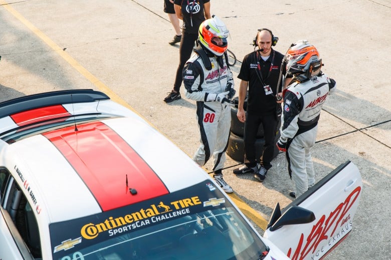
If you’ve watched just about any professional endurance race on TV, you would be familiar with heavily accented announcers talking to us about how badass these pro level teams are. One of the many things you’ll often hear mentioned is telemetry – A continuous live data report of the car’s health and performance being sent back to the pits for analysis by teams of engineers in real time. While it may sound over the top to some, this information plays a large role not only in making the cars faster but also in keeping them reliable.
At the grassroots level live telemetry might be expensive over kill, but recording data for later analysis is one of the best and cheapest ways of improving both the car and the driver. In the last 10 years, data analysis systems have become incredibly affordable while still being able to perform functions advanced enough for professional racing teams. Even an entry level system, when used correctly, will not only have the potential to save your engine, but it will almost certainly cut half a second or more off of the lap times of your car.
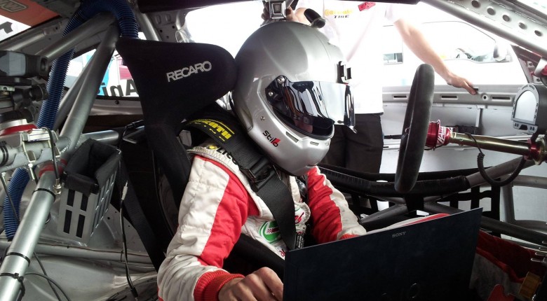
If you’re willing to put in the time to learn the software as well as what to look for, the claims I make are actually very conservative. I know that I’ve personally improved tremendously over the last few years by learning how to analyze and improve my performance based on the data. There are a number of good data systems on the market, but if you’re going to spend the money you want something that also acts as a display. The best thing about having a digital dash is that you can program most of them to alarm you when a certain parameter gets outside of your pre-set safe boundaries. This is a critical feature. No driver is able to watch all of the gauges constantly during a race. Many, if not most engine failures on the racetrack could have been avoided by stopping when the tell-tales threw in the towel, so we’re talking about cheap insurance here.
Simplifying the driver’s job is only the start. When we look at the data after a session we can see where the driver has made mistakes, where he or she has “left time on the table”, and by comparing different laps against each other we can see what the best potential lap could have been and plot new strategies for the next session. On numerous occasions I can remember going through my best laps second by second against each other looking for tenths of a second - It’s like hunting for time.
There are sensors available for just about anything you could imagine analyzing (and some you probably couldn’t). Sensors are expensive though and particularly when you’re learning to analyze data, too much information can be confusing. The best idea is to start with a simple set of sensors, and then expand the system as your analysis abilities (and budget) improve. Here is a quick outline of what to use when getting started:
The bare minimum to get any useful information would require the recording of RPM, vehicle speed, throttle position, lateral (cornering) and longitudinal (acceleration and braking) G force, and lap time (either via a timing beacon or GPS sensor). Since we can also use the data to monitor engine health it is smart to monitor oil pressure, oil temp, and water temp. With this information we can get a good sense of the ability of the driver, how often they are on the limit of the tires, how hard they brake, how smooth they are, how early and aggressively they are picking up the throttle and more. On the engine side of things, we can observe and record trends such as water temp vs oil temp, water temp versus ambient temp, and we can also be on the lookout for oil pressure problems such as surge.
So what do you do with this information? Well, let’s consider viewing speed and throttle position at the same time. Say that on lap four exiting a corner our Stig got on the throttle earlier, but at a slightly slower speed. On his best lap, in that particular corner, our driver got on the throttle much later but his mid-corner speed was higher. He felt that corner was awesome and bragged that he was on fire. Well, the data shows that on lap four that the car gained 4 mph in straight-line speed, and while the best lap was 0.2 seconds faster in the middle of the corner, the driver lost 0.5 seconds by the end of the straight. We’re talking three tenths in just one corner, and I see it all the time.
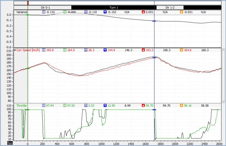
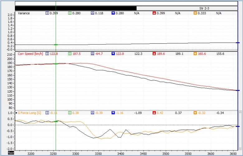
This overlay compares two different pro drivers. The red driver carried more entry speed – but at a net loss as he came to full throttle 100 ft. later than which ultimately cost speed down the entire straight, losing 1.5 tenths. It is likely that the optimal would be a blend of the two drivers, coasting more speed in while still getting to throttle at the same point as the black driver. Another example for speed plus throttle position would be to compare braking zones. I’ve observed a difference of 10 meters braking from 140 mph-40 mph to be worth roughly 0.150 seconds. If you’re paying attention, you’ll realize that we’ve already found a potential 0.450 seconds with just two minor driver tweaks.
Let’s move onto the G sensor. By looking at the longitudinal G force versus speed we can see how consistent the driver is in braking. As soon as the driver goes to heel-toe on a downshift, they will naturally change their brake pressure - Almost all drivers are guilty of applying less than optimal brake pressure when blipping the throttle. If the driver claims it’s impossible to brake any later but they’re not maintaining peak braking g’s throughout the braking zone then you need to help them develop that skill so that they can go deeper under brakes and still make the corner.
In this overlay the red trace is a pro driver and the black trace is a gentleman driver. We can see the gentleman makes the same peak decel G but on the downshift blip the braking is reduced to less than 0.5G. This is an area for improvement that would allow the gentleman driver to brake later and ultimately shave lap time – in this example the pro was a tenth faster in the braking zone. The sum of lateral and longitudinal G forces can be calculated into a channel called “Total G” that can indicate how well the car is “riding the rim” of the traction circle – or how good of a job the driver is doing of keeping the car at the limit of the tires as he transitions from braking to cornering to accelerating.
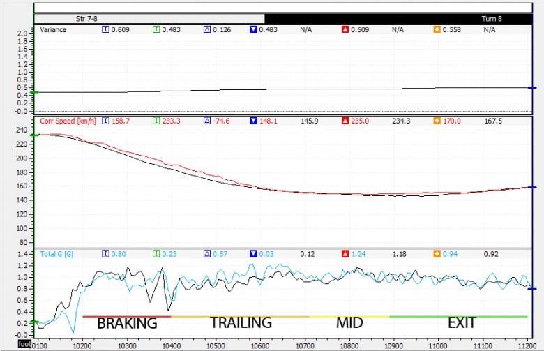
In this overlay the red trace is a pro driver and the black trace is a gentleman driver. We can see that both drivers have fairly similar Total G in braking, mid and exit, but the pro driver is able to produce more Total G trailing into the corner, by rolling more speed into the corner and ultimately coming out over a tenth faster. This trace is a quick gauge of how effective the driver is at “riding the rim” of the friction circle – notice the pro driver’s Total G is always hovering right around the 1.0G mark whereas the gentleman driver spends significant time around 0.8G
This is just the tip of the iceberg. Eventually you’ll want more information to help improve car setup, and to get a fuller picture of what the driver is doing. Integrating data with video is a fantastic method as that data won’t tell you if you’re in a pack of twenty cars or if you’re out there all alone. The video helps analyze the line the driver is taking and makes it easier to correlate curb hits and balance issues with the data. Of course this is just a rough primer to help you realize how much there is to gain for driver development from data analysis.