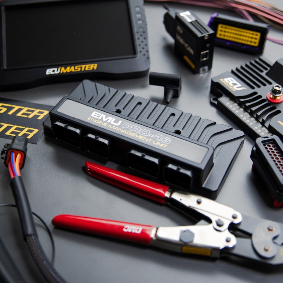
Professional Motorsport Data Analysis: Displays
Watch This Course
$197 USD
-OR-
Or
8 easy payments of only $24.63 USD
Instant access. Easy checkout. No fees.
Displays
07.39
| 00:00 | - Now that we have a better understanding of the user interface and its layers, let's take a closer look at the types of displays we'd most commonly see on an engineer's screen on any given race weekend. |
| 00:13 | A time/distance plot is probably the first thing that comes to mind when people think of data analysis. |
| 00:19 | It's also the type that gets used the most heavily. |
| 00:22 | The vertical axis is the channel of interest, whether that's brake pressure, wheel speed, or anything else, and the horizontal axis is either time or distance which is configured by the user. |
| 00:35 | Whether we use time or distance will depend on the specific analysis we're doing, however the most common when comparing driver performance for example is using distance on the horizontal axis as we can see here in this example. |
| 00:48 | When we're plotting vs distance, what we're doing is comparing the data at the same part on the circuit. |
| 00:55 | For example, how much brake pressure is driver A using at the entry to corner X, compared to driver B? By using the distance scale, we're able to compare the driver's at the exact same point on track. |
| 01:07 | Alternatively using a time scale as the horizontal axis means we would be comparing driver A to driver B after the same amount of time has elapsed into that lap which is essentially the time recorded since the last beacon trigger. |
| 01:22 | Assuming there's a difference in the speed and the driving line taken between the 2 drivers, then they will be at a different distance into their laps at the same amount of time. |
| 01:33 | Next let's take a look at the simply XY plot visualisation which is used for plotting any 2 channels against each other. |
| 01:40 | It's common for example to see lateral vs longitudinal G force plotted on this type of visualisation as we see here. |
| 01:49 | We generally use the XY plot when we want to compare the relationship between 2 variables to see if there's a trend or to understand the strength of that trend. |
| 01:58 | With this particular G force plot which is often referred to as a traction circle or GG diagram, where negative longitudinal acceleration is braking and positive is forward acceleration, we can see how the lateral load is being applied to the rear tyres in the dry phase and how asymmetric it is with respect to braking behaviour. |
| 02:19 | What I mean by this, we are getting very different behaviour with combined lateral and longitudinal load on acceleration relative to braking. |
| 02:27 | XY plots can also be used for non like qualities like roll angle and lateral G as shown here in this example. |
| 02:35 | This is useful for understanding relative front to rear stiffness of our suspension in roll. |
| 02:41 | Here on the vertical axis we have chassis roll angle and on the horizontal we have the lateral G force. |
| 02:48 | The slope of this relationship can be used to infer some properties about different suspension setups which we'll get into later in the course. |
| 02:55 | In the previous examples we just looked at, the plot points have been coloured by the channel colour but it's also usually possible to colour the data points by the value of a third variable. |
| 03:06 | This can be helpful to display a third quantity in an otherwise 2D view, giving us a kind of 2.5D perspective. |
| 03:14 | Here we can take the same previously shown XY plot of lateral vs longitudinal G force but we can colour the data points by throttle position. |
| 03:24 | Which gives us some more information than if we had just used a simple 2D plot. |
| 03:29 | Let's move onto the next viusalisation you'll commonly see in the pit area, the track map. |
| 03:34 | There are a number of ways a track map can be used but in the simplest form, it's just used to show the position of the vehicle on track. |
| 03:43 | The generation of the track map is handled by the analysis software, although some initial configuration might be required, the first time we use our data in the project. |
| 03:53 | For the logged data, a simple positional track map is helpful if we're not familiar with a particular circuit but once you get to know the circuit well, you're generally going to be able to recognise which part of the track you're looking at by using the speed trace without needing a track map. |
| 04:09 | It's also usually possible to have a track map where the colour of the track is defined by a chosen channel value. |
| 04:15 | For example, brake pressure, or accelerator position. |
| 04:19 | This can sometimes be convenient as it's quite intuitive to understand. |
| 04:23 | In this example, we had the track map coloured by brake pressure, where red is high pressure and blue is lower. |
| 04:30 | This makes the information intuitively very easy to understand. |
| 04:34 | Displays like this can be helpful to use with some amateur drivers who aren't used to looking at logged data. |
| 04:40 | Next, let's take a look at the histogram. |
| 04:43 | This is simply a way to see how the amount of a certain quantity is distributed. |
| 04:47 | This distribution is broken up into bins. |
| 04:50 | So for example, if we want to know what the distribution of throttle percentages are over our lap, the histogram display would be perfect for this. |
| 04:58 | The distribution simply means how much of the lap which can be in time or percentage, is spent in each range or bin. |
| 05:06 | In this example, the throttle position has been broken up into bins of 10% increments. |
| 05:11 | We can see that approximately 30% of the lap is spent at throttle positions between 0 and 10%. |
| 05:17 | 2% of the lap is spent between throttle positions of 10-20% and 54% of the lap is spent at throttle positions of 90% or greater. |
| 05:27 | You can generally configure a histogram to have the vertical axis as time or percentage depending on what's most relevant. |
| 05:35 | Next the gauge display can be thought of as a way to show something in a similar way to what you might see on a real dashboard in a car. |
| 05:42 | Gauges generally only show a single value at a single point in a log file at one time. |
| 05:48 | Here's an example of some different gauge types, in this case all showing steering angle. |
| 05:54 | Note that at the top we have the steering angle plotted over an entire lap on a time distance plot and the point where the cursor is sitting is the point that each of the gauges are displaying. |
| 06:06 | If we replay the data, we can see how the gauges update to the current value whereas the time/distance plot shows us a full history of the lap. |
| 06:15 | As with all display types, the choice and configuration of each display depends on what you're interested in and how you want to visualise it. |
| 06:24 | Obviously some of these gauge types shown here are more suitable than others for showing a quantity like steering angle. |
| 06:31 | But I just wanted to show you some of the different types available. |
| 06:34 | Lastly, let's get a feel for the channel report tables and how they work. |
| 06:39 | Channel report tables are used to quickly calculate some statistics from single or multiple log files simultaneously which gives a quick summary to the user. |
| 06:49 | The user has the choice of which statistics should be automatically calculated and in the case of this example the minimum, maximum and average values for speed and brake pressure is shown for 2 different drivers. |
| 07:02 | Channel report tables are often used to look for reliability issues. |
| 07:06 | Minimum oil pressure over a given run for example. |
| 07:09 | But they're also helpful for performance aspects and can be very powerful when we leverage the built in statistics functions. |
| 07:17 | The behaviour and outputs of the reports can generally also be heavily customised to suit your own purposes through the use of math channels. |
| 07:26 | This opens up the possibility to calculate your own custom statistics as well as being able to go to a higher level of granularity than just a per lap basis. |