275 | Driver Analysis Basics
Summary
A data analysis package has a huge number of built in tools to help understand the relative performance of your driving. In this webinar we’ll look at some of the most commonly used tools in detail. The Time distance plot, throttle histogram and more.
| 00:00 | - Welcome to today's member's webinar guys. |
| 00:02 | The topic today is on motorsport data analysis but we're specifically going to look at some techniques for understanding differences in driving or driving technique. |
| 00:12 | In the previous where I sort of gave a bit more of an overview of data analysis in general, I did do a few examples there but today I just really want to focus on some of the display types that we make the most use of when we're doing driver analysis. |
| 00:26 | Definitely comparing a faster driver to a slower driver which is usually of really great value. |
| 00:34 | So I'm just going to jump across to my laptop screen and we'll start going throught it. |
| 00:39 | So I'll do a little bit of a recap, just of the last parts I talked about in the previous webinar. |
| 00:45 | Essentially the guys of when we're looking at driver analysis is we're starting with the basics of things like differences in the speed traces and then once we know where there's a performance difference or where there's a driving difference, both based on the variance and the speed trace, we can dig into, if we're logging things like the driver inputs, things like in this case got throttle position, brake pressure, steering angle, we can dig into a little bit more detail and actually understand where those differences are coming from. |
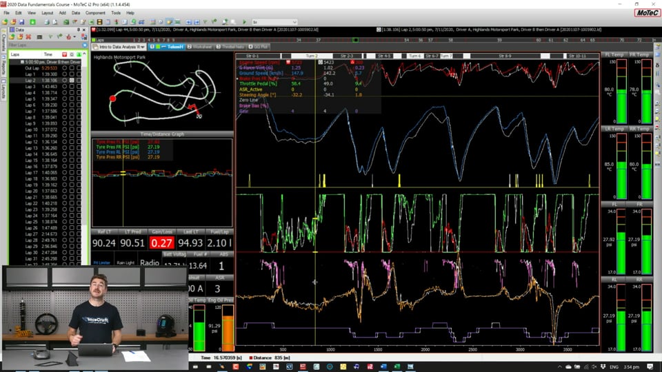
| 01:15 | So this first display I've got shown up here is what you often see called a time distance plot and the reason for that is that on the Y axis, this is where we've got all our channel values showing. |
| 01:29 | But on the X axis this is where we've got the option of showing either distance, which you can see is listed down here because I've got it shown in metres. |
| 01:35 | Or time. |
| 01:37 | So one of the ways, I'm going to do all of today's, I should also say all of today's demonstration's going to be in MoTeC's i2 but all of these things I'm going to show today are going to be generally applicable regardless of the data package you're using. |
| 01:49 | At the top here, there's this little clock symbol, so if I click that, that changes, you can see down the bottom here, now the axis has changed to time, so we can see this is shown in seconds along the bottom here and we can see the amount of time it takes to get through a lap. |
| 02:06 | One of the really important things to understand is that particularly in driver analysis, you're almost always going to be looking, wanting to use that X axis as distance, not time. |
| 02:17 | So the problem is, and it becomes pretty clear when I look at it on a time scale which is what I'm showing here. |
| 02:23 | Now I've got 2 laps highlighted of quite different times so you can see I've got my lap selection channel section down the side here. |
| 02:30 | Now in this case MoTeC makes the fastest lap highlighted by orange and this little button looking thing here is indicating which lap I've got selected. |
| 02:41 | So if I was going to select a different lap, if I just left click on this one here, it will change the different lap that is selected. |
| 02:48 | I'm going to keep the fastest lap open there to start with. |
| 02:51 | And I've got my overlay lap here set as a relatively slow lap and I just want to, I'm going to use these two laps as most of my example here today just to make the differences between the laps much clearer which will make some of the concepts a little bit easier to illustrate. |
| 03:08 | So you can see in this case we've got a lap time at 1:38 which is at the start of a race and we've got another lap time here in the 1:32 region so this is 6 seconds difference so it's an enormous difference in the lap time but it's good for being able to see these differences clearly. |
| 03:24 | So in the speed, the shape of the speed trace here, you can see we've got these features where you can see these load points in the speed trace where you're in the middle of the corner, and obviously these peaks here are when you're at the fastest point on that straight and then when it's dropping here that's when you're braking, getting into the corner and accelerating back out again. |
| 03:43 | So you can see these features that describe the middle of the corner or roughly the mid corner and you can see as we move throughout the lap, these things are moving, these features that you can see are really becoming more and more skewed and drifting further and further away from each other. |
| 03:57 | And this is really the crux of why we don't tend to use time as a comparison when we're doing driver analysis. |
| 04:05 | What we're doing here is comparing data at the certain amount of time into the lap. |
| 04:09 | What we often want to do is we want to compare the different distance into the lap or the position on track. |
| 04:17 | So if I switch back, I click on the clock again and we switch back to a distance scale we can see we've got the distance shown along the bottom here. |
| 04:25 | So the idea here is that the software is using the built in distance calculation that's happening inside the logger to approximate as closely as it can, the posiiton of the car on track. |
| 04:37 | The reason the position's so important is because we want to be comparing the driver inputs at the same point on track, not in the same time into the lap because obviously a slower driver is going to be at a very different position on track because they're fundamentally slower, they're going to be earlier into their lap as far as a distance perspective than the faster driver will. |
| 04:56 | So hopefully that makes it clear to you guys why it's so important to make sure you're using time or distance. |
| 05:02 | Sometimes if you make displays or you're working quickly, it can, you'll often where the data didn't align where you expect it to align. |
| 05:09 | the first thing to check is to make sure that you're using a distance scale and not a time scale. |
| 05:14 | So the other big tool I wanted to review before we go any further today was something called the variance or the time delta. |
| 05:20 | So the variance or the time delta is essentially giving us a visual representation of the time difference or time slip across the lap. |
| 05:26 | So the idea is that one lap, can be from the same driver, is one lap is getting faster and faster over the lap, you'll see the variance increase and the easiest way to show that on my laptop screen is by in this case in MoTeC, you can just press F3 to bring it up. |
| 05:43 | In the areas where we've got the biggest loss, so for example at the first corner on this track in this area of the speed trace here, it's pretty clear there's a really big difference between the coloured trace, which for everything I'm going to do today, the coloured trace is the fastest driver and the white traces are for the slower driver. |
| 05:58 | So in this area where it's pretty clear there's pretty big difference in the speed, we can see there's this big spike in the variance channel. |
| 06:05 | So you can see straight away that these spikes in the variance channel are going to be a really good tool to help us focus on the points we want to improve our performance. |
| 06:13 | And that's actually a really good point as well is that when you come in and download your car after each run on track, you're not, well you're never going to be able to improve the entire lap on the next outing. |
| 06:24 | What I mean by that is regardless of whether it's a car setup issue or whether it's a driving issue or a track condition issue, regardless of what the difference is that you're trying, what you're going to do to try and improve the performance, you're not going to be able to do it all at once, you really need to start with the biggest losses first. |
| 06:39 | And that's what the time variance or time delta is really useful for doing. |
| 06:43 | So we see here, where we've got this big difference in the speed, we see the variance increase steeply, again we've got another big difference in the lap here. |
| 06:52 | And this is actually even more noticeable, we've got a big steep loss happening here. |
| 06:55 | And later in the lap there are a couple more of them. |
| 06:59 | Essentially anywhere where you've got this steep rise in the time variance is where we've got a point on track where we want to dig into. |
| 07:06 | And that's often what I use to point me into the parts of the data that I really want to focus on as I look for those steep parts in the time variance and then I really go and dig into the data itself, which we'll get into a little bit more in a second. |
| 07:18 | It's also important to understand that you often get these sections, so where you've got the, in this case the convention we using, where this line here is getting steeper like this, you've also got these sections where it's dropping off before recovering again. |
| 07:36 | Now theoretically anywhere you've got a line that's dipping like that, it's showing that the reference is actually doing better than your currently selected lap. |
| 07:47 | It's a little bit of a trick in this case and I'll go into it a little bit more, what's happening but one of the things you often see happening is if you brake too late into a corner, because you're braked later, so you've got your two cars heading down the track, if this car here's going to brake later, so they're heading down, this car on the left, this one here, may be the faster car but if one car brakes deeper, because they're at a point on track that they're faster at that point on track than the reference car, they're going to get a gain so you're going to get that slope coming down but if they brake too deep or too late, they're not going to be able to slow the car enough for the corner, they're going to overshoot the apex and the reference car is going to get a gain on it. |
| 08:26 | And that's essentially one of the things that you'll see here, like in this example, where you've got this dip in the variance followed by a loss again. |
| 08:33 | So you've sort of ended up between these two sections, you've ended up with no net difference and that's because of a difference in the way the car's been driven into the corner. |
| 08:42 | So that's a feature to look out for when using the time variance is these sort of fake gains where you think oh I'm doing much better on entry but then you lose it all on exit. |
| 08:50 | That's usually indicating it's something to do, one of the things it can indicate is it's something to do with the way the car's being driven on the entry to the corner. |
| 08:58 | The other thing I want to talk about on that as well is the idea of lap stretching. |
| 09:03 | So even though I've got metres shown along the bottom here, as in distance into the lap, one of the things that can trip you up is the distance into the lap is always a bit of an approximation. |
| 09:15 | So the distance that the car's calculating, that the logger is calculating as you move through the track is an approximation based off your speed input. |
| 09:23 | So if you're using GPS for your speed input, it's obviously an approximation based off the GPS signal. |
| 09:29 | More commonly or in some cases, you've also got wheel speed which is also used for the speed calculation. |
| 09:34 | Obviously there are a few potential sources of error whether it's difference in tyre pressures giving you a different loaded radius or particularly different driving lines as you head around the track, it's going to end up, one car's going to be taking slightly longer to get around a lap. |
| 09:49 | Now one of the differences when it comes to, one of the things you've got to be careful of when it comes to doing driver analysis is that you're comparing like places on track. |
| 09:57 | So what I mean by that is if I just zoom into a specific section on track here, one of the things you'll often be doing is looking at the different positions on track where you've got, let's just actually zoom in a little bit later into the lap where it's a little more obvious. |
| 10:13 | Yeah one of the things you'll often be doing is looking at when a particular event happened or where on track something happened. |
| 10:21 | So how early someone got on the throttle of one driver vs another. |
| 10:24 | Particularly if you're using data from a different driver, a faster or slower driver. |
| 10:28 | So in this case, I've got the colour line lifting off the throttle earlier than the white line. |
| 10:35 | Now because you can get those errors in the distance calculation, that's where you've got to be careful of making sure things are properly aligned. |
| 10:41 | Now there are a couple of ways you can do that as far as checking the alignment and it is, it's not something that you always need to worry about but it is something that's worth keeping an eye on. |
| 10:51 | There are a couple of different ways you can check the alignment and what I mean by the alignment is just making sure log files are actually comparing the exact same position on track. |
| 10:58 | Two common ways are to either use a damper potentiometer or to use the vertical G channel. |
| 11:03 | The idea behind both of those is as you head around different parts of the circuit, you sort of end up with a bit of a fingerprint or a profile as the car traverses certain bumps or dips in the road and obviously you can pick those up from either the damper position or from the vertical G sensor itself and what I've got plotted down here at the bottom down here is the vertical G force. |
| 11:23 | Now you can sort of see quite clearly already that these, we've got these features here that are coming from bumps in the track. |
| 11:33 | And you can see that these aren't actually very well aligned. |
| 11:36 | So this is telling us straight away that we've got an alignment issue because we've got a lap stretching issue between our two sources of data so what we can do, in MoTeC anyway, and this is, you can always do this in every data system, you can press O for offset. |
| 11:53 | Now if I just drag that manually, pull that across, you can see these features now are much better aligned. |
| 12:00 | So that's what that's telling us, it's giving us sort of that fingerprint of the circuit. |
| 12:04 | Now we can be pretty confident that because this feature in the vertical G is coming from a bump in the track, now we can be pretty certain that the lap distance is really well aligned. |
| 12:16 | And that's really important if you're going to start talking about differences in braking markers or differences in when they're getting on and off their throttle, who's doing it earlier, who's doing it later. |
| 12:25 | It's really important you make sure you're looking at the right position on track. |
| 12:27 | Now different cars, different circuits, depending on the different types of analysis you're doing, you might have more or less problems with doing, with looking at lap alignment issues, but it's just something you need to keep in the back of your mind if you do start looking at different points where people are, who's braking here, who's braking there? You need to make sure that you are actually comparing apples with apples. |
| 12:48 | And making sure that you're making a fair analysis of the data that you're looking at. |
| 12:56 | Now one of the other tools that I make a lot of use of in my analysis is a throttle histogram. |
| 13:02 | The idea behind a throttle histogram is it's giving us sort of a basic set of statistics that are calculated for us about how much throttle is used over a lap. |
| 13:10 | So the idea is that generally something that generally correlates really well to performance is how much full throttle is used over a lap. |
| 13:20 | So generally speaking, if you're comparing two different laps, the lap that has the higher percentage of full throttle is almost always the faster lap. |
| 13:29 | I'll put together one of these histograms now to show you guys, to make that a little bit clearer what I mean by that. |
| 13:35 | So I'm just going to make a new worksheet here and call it throttle histogram. |
| 13:42 | And we'll start with a blank worksheet here and if I go into i2's options here, these are the different display types I can start building up my displays with, I'm just going to go to a generic histogram. |
| 13:53 | Now we've got the option for which channel we want to report on so in this case it's going to be the throttle. |
| 13:59 | In this particular logged data which is, I should have said at the start is for a GT car running at one of our local tracks. |
| 14:07 | In this case a mid engine rear wheel drive GT car. |
| 14:10 | We've actually got two throttle channels and this is important to understand as well, we've got the throttle position channel, we've also got the throttle pedal channel. |
| 14:19 | So depending on what you're interested in, as far as what you're looking at the data, whether you're doing maybe a powertrain or reliability analysis, or whether you're looking at the performance of the driver will depend on which channel you want to look at. |
| 14:32 | In our case, we want to look at the throttle pedal because we're trying to look at it from a driver input perspective. |
| 14:35 | Well this particular car anyway certainly has electronic throttle bodies, which obviously there's some different control strategies depending on whether that's a linear relationship with throttle or different cases where it might be used for traction control and stuff like that. |
| 14:49 | So in this particular case we want to make sure we're looking at the throttle pedal which is giving us an approximation of the torque demand by the driver rather than the torque response that we're actually getting at the engine. |
| 14:59 | So I'm going to select throttle pedal, if I just click OK. |
| 15:03 | Now straight away this gives us a little bit of an overwhelming perspective, just before I get into explaining it, I'm going to come back and change the options. |
| 15:09 | Essentially what's happening here is it's discretising the throttle down into 50 bins, I want to put it into 10 bins. |
| 15:16 | So in the options, going to come back and put it into 10 bins and this will become a little bit clearer now. |
| 15:20 | So essentially what we've got is on the Y axis, we've got throttle percentage. |
| 15:24 | So it's been automatically scaled for us but in this case, it's 50% and 0%. |
| 15:32 | Sorry the Y axis is the amount of time that's being spent as a proportion of the lap in each throttle percentage. |
| 15:40 | So this is the amount of time of the lap that's being spent. |
| 15:44 | And along the horizontal axis, we've got which throttle percentage. |
| 15:48 | So we've got 10 sets of bars here. |
| 15:51 | If I just get rid of the overlay for a second, just make it a little clearer. |
| 15:55 | So this is just looking at the primary lap, we've got 10 sets of bars starting from 0-10% all the way to 10-20, 20-30, all the way up to 80-90 and 90-100%. |
| 16:06 | So it's essentially breaking the throttle input down into these different bins and we're calculating how much time over a lap has the throttle been spent in each one of those bins. |
| 16:16 | So if we have a look at this value up here, I can look across to the vertical axis, we're spending roughly 45%, in this sort of area here, looking at this position here, this is telling us we're spending roughly 45% of our lap in between 90-100% throttle range. |
| 16:35 | And then as we move down, we're seeing down here right at the bottom in the 0-10% we're spending roughly 27% of our time, 27% of our lap is being spent in the 0-10%. |
| 16:50 | So now if we go back and add our overlay back in. |
| 16:53 | So the white is from a slower lap. |
| 16:56 | We can see here a really big difference in the high throttle percentages Suddenly we've got the slower driver using around 35%. |
| 17:05 | So the faster driver was using 45 at full throttle, the slower driver was using 35% at full throttle so straight away we've got a 10% difference of the time of a lap that the car's being spent at full throttle so that's a massive difference. |
| 17:19 | And consequently we've got the slower driver not only using more time at no throttle or zero throttle, but you can also see that throughout the lap, they're spending much more time at part throttle. |
| 17:30 | So one of the ways you can use a throttle histogram is to use it to point you towards certain features in the data. |
| 17:37 | So you can use this as a way to really quickly summarise what's happening with the data, really quickly looking at this throttle histogram without having to go through the throttle trace itself line by line or corner by corner. |
| 17:48 | You can get a really quick summary, you can see straight away I know that this white driver in this case isn't getting to full throttle early enough within the lap, they're spending much too much time in the part throttle which is this region here where we see all these differences and they're not getting to full throttle quick enough. |
| 18:05 | So whether that's a grip issue or more often that not, a confidence issue, which between these two data sets, this is actually two quite different drivers running in the same car. |
| 18:14 | The purpose of these tools, things like a histogram is it's giving us a really quick summary that's going to give us a way, something to point to, go to look at specifically in the log data itself. |
| 18:26 | So if I was to bring up, I'll just bring up, actually I'll go back to our previous display just to save some time here. |
| 18:31 | This is a really typical example in this section of track here. |
| 18:35 | So we've got our white driver, remember he's spending less time at full throttle and we've got the colour driver which is the faster driver. |
| 18:42 | So you can see in this section in particular here, at this corner exit we can see the colour driver getting to full throttle much earlier than the white driver. |
| 18:51 | So that's the idea there, without us having to go into the log data and really skim through line by line, the histogram's giving us a summary and now it's giving us something in particular to look for in the log data so we can go through and look at which corners the slower driver needs to work on, which corners we really need to get him to ramp the throttle harder. |
| 19:09 | The other thing that's really important to understand about the histogram is that they are zoom linked. |
| 19:18 | So if I head back to our histogram I'll show you exactly what I mean by that. |
| 19:22 | So I'm just going to add in a time/distance plot just to make that really clear. |
| 19:26 | I'll just add in a speed channel so we can see a bit of a speed signature for the lap. |
| 19:31 | I'll just bring that up here. |
| 19:40 | So again I'll just flick that back to distance mode. |
| 19:44 | So at the moment we are by default looking at an entire lap. |
| 19:47 | So from this point here to this axis here, in both cases this is looking from one beacon or one start/finish line to the other. |
| 19:55 | And that's what, what I mean by zoom linking is that the amount of zoom level we have showing on the time/distance plot will be reflected in the histogram. |
| 20:03 | So let's say if I just look at this particular section of track in here, you can see here that the histogram has totally changed in the way it's working, so if I go back to, I'm going to press W to zoom back to a whole lap, we can see that the histogram again is zoom linked so if I just zoom in further and further and further on a particular section of track, we can see the statistics that the histogram's calculating for us are changing. |
| 20:24 | So that's one thing to be aware of when you're using a histogram to look at differences in something like throttle percentage is to make sure that almost always you'll be looking at it over a whole lap. |
| 20:34 | If you skew, if you go into a certain one different section of track, you may end up skewing your histogram and it might not be giving you something useful anymore so it's definitely something to be aware of is to be aware that most systems, the histograms will be zoom linked. |
| 20:50 | Now there's another type of driver plot I wanted to make you guys aware of today and go through a little bit of data on and that's the GG plot. |
| 20:58 | So this is where we're plotting the G forces that we measure inside the car on a plot, on a scatter plot and we use that to understand differences in how the car's being exploited so I'll put that together now to show you. |
| 21:10 | So if we just say GG plot, make a new worksheet here and I'm just going to add in a scatter plot. |
| 21:18 | Now on the Y axis, the Y axis is what we're going to describe for the longitudinal directions. |
| 21:25 | I'll put these on here and I'll come back and explain them a little bit more in a second once there's actually something to explain over but for now I'm going to add in the Y axis, I'm going to put longitudinal G and for this particular car this is the channel, long G, that we want to use. |
| 21:38 | And on the X axis of the scatter plot I'm going to put lat G. |
| 21:42 | So I'm just going to unskew this a little bit, just makes it a little bit, I find it a little bit easier to look at these when they're a little bit squarer rather than being completely stretched out. |
| 21:53 | Essentially what this is showing us is if we see our, this is our zero point here, here and here on each axis. |
| 22:01 | So we've got lateral G across this axis, and we've got longitudinal G on the vertical axis. |
| 22:06 | So anything that's above 0 on the vertical axis is where the car's accelerating, everything below is when it's braking and each side is obviously our lateral forces. |
| 22:16 | And the really important, one of the really important things to understand about a GG plot is it's really useful to understand how not just what the extremes of maybe your peak lateral and peak longitudinals for braking and accelerating forces are, it's really useful for understanding how those forces are being combined. |
| 22:33 | What I mean by combined is a lot of the lap or a lot of the performance in lap is often gained and lost in the sections where you're both braking and turning or accelerating and turning at the same time. |
| 22:44 | Those are the points where from a driving perspective, there's often the biggest difference is when you've got difference in driver skill level. |
| 22:50 | So straight away, again this is zoom linked so we've got our two drivers plotted, again the coloured driver is shown in red and the slower driver is shown in white. |
| 23:01 | And just sort of generally looking at this plot, you can see certainly in these areas around here and in these areas around here and definitely in these areas around here, you can see straight away that the colour driver is using, sort of exploiting a wider envelope, that's one way you can think of the GG diagram, it's sort of giving you a performance envelope. |
| 23:22 | Any time that we're heading around the lap, any time you can maxmiise the acceleration, whether they be longitudinal with accelerating or braking or lateral. |
| 23:31 | Any time you can maximise those accelerations, that's always going to lead to a performance advantage. |
| 23:35 | So if you think about that GG diagram essentially giving you the wider it is the wider the performance envelope is, that's a good way to think about it and we can see that this coloured driver has certainly got a bit bigger envelope than the white driver and that's pretty typical when you're looking at the difference in data sets between say a pro and an amateur which is what this data set is. |
| 23:57 | We've got a gentleman driver versus a professional driver. |
| 24:00 | So the other thing to discuss about the GG plot is you've got sort of a non symmetrical look. |
| 24:06 | So if this is kind of our zeroish line, it's not a very straight line there but that gives you an idea of where roughly the zero line is longitudinally. |
| 24:15 | It's quite asymmetrical as far as we've got this sort of shape here and it's much much deeper along the braking zone, so we've got braking down the bottom here and acceleration at the top. |
| 24:25 | One of the reasons for that is the car's going to almost always generate a lot more longitudinal force in braking than they can in accelerating. |
| 24:32 | They're often a lot more power limited and there's often a lot more braking force available. |
| 24:38 | Not necessarily grip as such from the tyres but just what's actually available to give from the braking system. |
| 24:44 | The braking system's not usually the limiting factor. |
| 24:47 | And that's why you often see, you almost always see the skewed shape where you've got this longer shape in the braking zone and a little bit more of a flatter shape at the top and that's why you often see these, or sometimes you'll see people describe a GG plot also as a heart diagram because you can end up with this sort of shape of a heart that looks a little bit like that. |
| 25:09 | One of the ugliest hearts I've ever drawn. |
| 25:13 | So one of the things I want to dig into this in particular was talk about the combined loads. |
| 25:20 | So again I'm just going to bring up a little time/distance plot here for a little bit of reference to add in for you guys just to help understand what's happening here. |
| 25:30 | So again if I just bring up the core speed, just bring that to the top and put that there. |
| 25:38 | Again I'll just flick back to distance mode rather than time mode. |
| 25:42 | And just for a little bit more context again I'm going to bring in the track map. |
| 25:46 | So I'll just bring this down here just so you can see a little bit of the sections I'm talking about. |
| 25:52 | So one of the great thing you can do in i2 and lots of data analysis packages is you can click on an XY plot and it'll show you where in the lap that cursor is which I find really helpful. |
| 26:03 | In this case, I can drag the cursor around and you can see on the scatter plot you can see there's a cursor moving around different parts of it where it shows me where that cursor is. |
| 26:14 | In the same way I can click on a certain part of the lap on this scatter plot and it'll put the cursor on the time/distance plot to show me where I am in the lap which I find really helpful when I'm looking at a certain position of interest. |
| 26:25 | So as I zoom in you can see again we've got that zoom linking effect where it's sort of just cleansing that XY plot and only showing us the points of interest that we're showing on the time/distance plot which I think is a really helpful feature. |
| 26:37 | If I just zoom further and further and further into here, I'm just going to really concentrate on this area which is braking into quite a slow corner. |
| 26:45 | So in this section, I want to concentrate on this area in here of the scatter plot and the reason I want to focus on this is down here at the very bottom, this is where weve got pure straight line braking and at the extremeties at the edges here, is where we've got pure lateral cornering. |
| 27:05 | Everywhere in between, so in this area here, everywhere in this section, this is where we've got combined load. |
| 27:12 | So this is where the car is, in this case braking and turning at the same time. |
| 27:16 | Like I talked about before, that's often where you'll see some of the biggest performance differences, particularly between a pro and an amateur driver. |
| 27:22 | So one of the things that's quite clear to me here is how much wider this envelope here is for the coloured driver. |
| 27:29 | So this is, there's a lot more shape to that curve. |
| 27:33 | Ideally we want to be able to transition from straight brake, transitioning smoothly around to cornering, into pure cornering until you transition back to accelerating again. |
| 27:42 | It's much clearer here we've got much more of a straight line. |
| 27:45 | Really to accentuate those trends between those two driving styles. |
| 27:51 | And in this particular case, this is going to be a big point of time loss between these two drivers where you've got one driver exploiting much more of the combined tyre load, where they're pushing right to the edge of both the longitudinal and the lateral components at the same time as opposed to driving it much more straight, turning and accelerating straighter where you're not using as much of the combined force, that's really going to lose you quite a lot of time on track. |
| 28:17 | One of the other things you'll often see that's interesting, if I just zoom back to the full lap again, is you've got differences in downforce. |
| 28:30 | So one of the things that obviously, all of our both lateral and longitudinal forces are going to be affected by how much downforce we have and what I mean by that is obviously if we add downforce to the car, that's putting more vertical load on the tyres, that's going, assuming we're not power limited, so certainly in braking and cornering, that's going to give us more lateral and more braking capability if we've got more downforce in the car and more vertical load on the tyres. |
| 28:54 | So what that's essentially going to do is widen your envelope and that's a little bit what we see here if I get rid of this, let's see if I can make this obvious for you guys. |
| 29:03 | I'm going to do a bit of a dirty trick here. |
| 29:06 | And I'm going to pull one of these slower corners back to, so in this section of the lap, this is quite a long fast corner which if I bring the track map again, I put the cursor there, you can see where the cursor's lining up on the track map down here. |
| 29:19 | This is a very very long, almost constant radius, quite high speed corner, you can see the speed range for the colour driver there, 150 km/h range so certainly in this particular car, certainly fast enough to have a significant downforce effect. |
| 29:33 | And if I'm going to compare that to a much slower part of the track, so this down here which is this section of the track which is the last slow corner of the lap before you come across the start/finish line, so I'm just going to do a bit of a dirty trick here by offsetting the data and I'm just going to see if I can overlay these and see if they look clear, there's a clear difference so I'm just going to overlay that slow corner with that fast corner. |
| 29:57 | Now granted, I am comparing two different drivers here but I think the differences will still be clear. |
| 30:03 | So what I've got here in the coloured data is I've got a car that's operating with much more downforce, where in the slow corner, we're here at the apex we can see at the top here we're around 55 km and we're roughly 100 km/h faster, 150, 155 area in the coloured section of the track. |
| 30:22 | So we can see straight away, obviously we've got a difference in cars being driven. |
| 30:26 | Certainly we can see that extension of that driver envelope or the car envelope that's being used when you've got more downforce available. |
| 30:35 | So I just wanted to make that clear that you will see the different way downforce manifests in the GG diagram as well. |
| 30:42 | Essentially it's going to give you elongated, particularly in lateral but certainly in braking as well, not usually so much in acceleration and that's because in acceleration you're quite often power limited rather than grip limited. |
| 30:55 | So that's it for most of the demonstration I wanted to give today. |
| 31:01 | Before I get on with the rest of it, I just wanted to remind you guys that if you do have any questions that have come up throughout the webinar so far, chuck those through to us now and the guys will put those through to me and I will get onto those once I've finished the lesson. |
| 31:15 | But for anything that's come up whether it's about data analysis or even car setup or race engineering or anything else to do with any of our RaceCraft material that you've got come to mind you're welcome to ask that and I will get into those soon. |
| 31:28 | So the last thing I wanted to go through today, looking at some of the driver analysis was looking at the idea of telemetry. |
| 31:36 | So I spoke a little bit in the last webinar looking at the difference between telemetry and log data, essentially to strip it down, telemetry is data that we're getting live off the car as it's heading around the track that's sent back to us in the pits over either a mobile signal, so like a 4G, 3 or 4G signal or by radio telemetry. |
| 31:57 | Essentially all of that data is coming in live, the log data is what we download when we download the car, so we plug into the car, pull the data down, there's a bit of a difference in those two pieces of data. |
| 32:06 | The telemetry data's often a lot more stripped down, usually because we're bandwidth limited, there's only a certain amount of data we can send over either the mobile or the radio telemetry. |
| 32:15 | Whereas the log data is stored in the solid state memory of the logger and it's something we can download later which means it is generally much higher frequencies, many more channels that we don't always need to see live in real time. |
| 32:29 | But I just want to show you a typical telemetry layout that I would tend to use on a race weekend. |
| 32:34 | So it's a little bit overwhelming to start with but I will walk you guys through, this is the main screen. |
| 32:40 | So typically when you set up your data analysis project, you make lots of pre configured views. |
| 32:45 | So in this case I've got my main telemetry view and if I skip through some of the different ones I've made today, these would be some preconfigured views depending on what sort of analysis I wanted to look at. |
| 32:54 | The idea is that you preset these up ahead of time so that when it's time to do your analysis, you're not stuck there making plots or configuring your plots, you can just use them straight away and depending how, the system you're using, there's different options for organising those. |
| 33:06 | In this case in MoTeC I've got the option to break it down into different subjects and then within those different subjects I can make individual worksheets and name them to something that makes sense to me. |
| 33:16 | So this is the main screen that I would have set up as my telemetry screen when the car's moving around on track. |
| 33:22 | The things that I want to look at are most obvious. |
| 33:25 | I should say as well, in most cases as a race engineer, I'm usually more interested in the performance aspects of what's happening. |
| 33:33 | I've usually got with me working on the same car a data engineer. |
| 33:36 | The data engineer is more focused on obviously downloading the car, making sure all of the electronic systems on the car are working, the cameras, the logging package itself, making sure the sensors are calibrated and the data analysis, sorry the data engineer, when you're in the session is often the one that's more focused on engine reliability or powertrain or reliability things in general. |
| 33:56 | Whereas the race engineer tends to be a little bit more focused on the performance aspects. |
| 34:01 | So my screen that I've got set up here is definitely more of a performance orientated main screen than what you'd have maybe if you were only one person looking at the telemetry, you might be skewed a little bit more towards some reliability aspects rather than just the performance. |
| 34:14 | So you guys should all be pretty familiar with a lot of this already. |
| 34:18 | We've got, if I just get rid of that to make it a little bit clearer, we've got some of our main channels coming through. |
| 34:25 | So I've got my engine RPM, vehicle speed, in this case actually I'll bring that legend back up, make that a little bit clearer. |
| 34:33 | I've got my ASR which in this case for this car is the term they use for traction control so this is just showing me when the traction control is intervening. |
| 34:44 | So that can be a good trigger for me to understand, because the driver has got a switch to adjust the traction control settings live inside the car, if I see a lot of traction control intervention, I can either make a change to the car or I can make a suggestion to the driver to make a change to the way they're using their traction control settings. |
| 35:02 | I've got our brake and accelerator traces here so if I just zoom in, it makes it a little bit clearer. |
| 35:07 | I often have these overlaid from each other so that means I put the accelerator and brake over top of each other and I just do that to help me, give me a little bit more vertical space to make sure I can see things a bit more clearly. |
| 35:17 | Otherwise just to make that clear, if I head back to my other one here, my first layout, I've got the brake and accelerator shown differently or shown separately on different lines. |
| 35:28 | Particularly when you're just starting out, I think that maybe it's a clearer way to see things when you split them up like this but I personally find that once you get a little bit more used to it, I prefer to be able to have them overlapped and it allows me to have them a little bit bigger which allows me to see a little bit more detail of what's happening on them. |
| 35:45 | So underneath that, this main orange one here is my steering inputs, this is my steering trace. |
| 35:50 | So I can see differences, for example we've got a small correction in this section here, I can see the colour driver is making a little bit of a correction as they're getting to full throttle. |
| 36:00 | They're obviously having a little moment with the car where they're needing to make a steering correction. |
| 36:05 | The same thing is happening here for the colour driver, there's this sort of quite rapid steering correction which is a sign of oversteer and we can see that's happening as they're starting to do their throttle ramp, that's when they're starting to lose the rear there. |
| 36:17 | And then at the bottom I have my gear position which is just really useful for understanding if there's something happening with the car, I want to compare one driver to the other, I can see oh they're using this gear in this corner and the pro is using this, maybe suggest to them over the radio they should be using a different gear in a certain, particularly slow corners. |
| 36:36 | This last one I've got showing here is my brake bias, so that's just a live calculation of the front and rear brake pressure and because the bias is adjustable from inside the car, if I've got a particular handling trait that we're struggling with, whether it's entry stability or maybe a bit of inside front locking on the entry to the corner, I can make a suggestion to their bias to make a bias change and just giving me a reference for how the bias is evolving throughout the lap or throughout their run which in this case is for endurance where you've got many many laps back to back. |
| 37:07 | Down to the side here I've got some bar graphs which are giving me tyre pressures so if I just press play up the top here it's just going to give me a bit of a replay of a lap in real time so you can see the cursor sort of moving throughout the lap and you can see in the track map the little dot moving through the lap there. |
| 37:21 | So you can see how the tyre pressures, which is in this bottom section here, and the tyre temperatures in the top, you can see how they'll evolve as the car moves through the lap. |
| 37:30 | So I've got those set up with some colour conventions meaning it's green if it's within my target, or if it's under it might go red or orange of if it's over it might go a different colour again. |
| 37:41 | So again it's just giving me a really quick visual reference for understanding if there's something happening with the tyre pressures. |
| 37:46 | I've got another tyre pressure display here which is showing me my tyre pressure evolution as we move throughout the lap which is what's happening in this plot here. |
| 37:52 | So I always use the same colour convention for corners of the car no matter what I'm talking about. |
| 37:59 | If I'm talking about something like a damper or a tyre pressure or any other sensor that's operating at either the front or the rear of the car. |
| 38:07 | Front let's always, for me, is always red, front right's always green, rear left's always blue and right rear is always yellow or orange. |
| 38:14 | And the idea behind doing that is it just, I don't really need to usually look at the legend, I can understand exactly which corner of the car I'm looking at without having to go and look up at the legend in the first place which I find quite a big time saver when things are time critical. |
| 38:27 | I have got some basic reliability channels down here so that's just for me to keep an eye on what's happening with the engine. |
| 38:35 | Particularly at the start of a session where maybe the engine might be a little bit cold or the gearbox might be a little bit cold, it's just a way for me to reference to understand, tell him take it easy on the out lap or work a bit harder getting some temperature into the gearbox before we do for it on the first flying lap. |
| 38:49 | Some stuff about fuel pressure, engine oil pressure, just really basic stuff for me to have quick reference myself if everything's reliability wise on the car is fine or maybe if my data engineer is distracted or dealing with something else in the moment, it just gives me a little bit of a backup on some of those basic reliability issues. |
| 39:09 | Then I've got some, in the top row here I've got lap time and fuel information so that's where I've got my live lap gain/loss, I've got the last lap time, the predicted lap time for the current lap and what the reference lap time that's currently loaded into the dash is, that's the reference lap for my time delta or my variance. |
| 39:27 | Also how much fuel was used on the last lap, I've got here the total fuel number, so the total amount of fuel we've used in the race so far, my ABS and traction control settings. |
| 39:38 | I've got here coolsuit current, so I use coolsuit current to understand maybe the driver's complaining that their coolsuit has stopped working, for us to understand whether that's because, if there's a mechanical issue or an electrical issue, one of the ways we can diagnose it is by understanding how much current is currently running through the coolsuit. |
| 39:58 | So that's just a really basic double check there. |
| 40:01 | We've got whether the headlights are being used, whether the radio's being used, if the rainlights are on, the pit limiter is on, stuff like that. |
| 40:07 | Just some really basic driver switches and inputs that they have in the steering wheel, just for me to see what's working. |
| 40:13 | The reason I've got the radio there is in the case where you've got a radio failure, so if you want to understand it, if you're not getting any response with them back on the radio, this is a light that's triggered when you have current flowing through the radio, so whenever the driver presses the radio button, it draws current through the radio power supply and that's sent over telemetry and that just gives us another diagnosis as to is there something actually wrong physically with the radio, is it with the wiring, are they not pressing the radio at all? And again that just gives us a little bit more of a heads up so when it comes time for the pitstop, if we've got a little bit of extra time while we're still putting fuel into the car, that we've got the option of maybe swapping the radio out during the stop or trying to give it some attention before we send the car out for the next stint. |
| 40:54 | So really the main thing about all of this live telemetry stuff is I'll be using it to coach the driver live. |
| 41:02 | So what I normally have is just this white lap showing up here. |
| 41:05 | So if you can imagine the colour lap would not be shown, it would just be my white reference lap and as this cursor moves throughout the lap, as we move throughout the lap, our coloured lines will be appearing behind it and each time you start a new lap again, the lap gets reset, all the colour stuff disappears, the white reference remains the same and the idea is that, it just gives me a reference for how much brake pressure they're using, how much throttle they're using, what the difference in the speed traces are, maybe what gear they're using. |
| 41:35 | So I be coaching them live on the radio, be saying hey listen at turn 3, I need you to use second gear and not third or I can say you need to concentrate on using more brake pressure at the entry to turn 7 because I've got my reference there, it's really clear for me to see that and it's a really useful live tuning tool that I can use while the car's actually on track. |
| 41:56 | And the beauty of that is that it's a big time saver and I don't need to wait until the car comes in, we download the car, I can sit down with the driver, go through the data, I can actually be talking to them in real time while they're on track so they can try it on the next flying lap rather than having to wait until they come into the pits and that really speeds up the learning process and in pro am racing which is a lot of sports car racing is where you've got a pro and an amateur and they're sharing the same car, a lot of the performance difference you're trying to find is looking at trying to speed the amateur up or trying to get them a bit closer to the pro and that's why having the pro in the car is so useful because it gives you a reference to work from. |
| 42:34 | OK guys so that's the end of the lesson I'm going to do today. |
| 42:37 | Just want to remind you guys about the data course that we've got our at the moment, lot of the material I've gone through today is covered in our data fundamentals course. |
| 42:45 | If you haven't already bought that, I definitely recommend going and checking that out on our website and also obviously our advanced data analysis course that's going to be coming out soon, at the end of the first quarter. |
| 42:56 | And remember if there's any more questions that come up if you're not watching this live, if you're watching this from our archive, if you've any questions that have come up throughout the webinar today, you can always go into the forum and ask them there and I'll be happy to answer them for you. |
| 43:10 | So I'm just going to head across to our chat here and I'm going to see if we have, if we have any questions that have come up from today's webinar. |
| 43:23 | It looks like we have 0 questions that have come up from today's webinar. |
| 43:27 | So either that means I've done a really good job of explaining everything or maybe it was a bit boring for you guys, I'm not sure which one. |
| 43:35 | But so for today I'll leave it there but again if any more questions come up for you guys, make sure you jump on the forums and I'll be happy to dig into your answers there. |
| 43:45 | Thanks very much guys, we'll see you in the next one. |